Group #6 by Albert Contreras and John Gove
Explore and Review:
“Great Unsolved Mysteries in Canadian History”
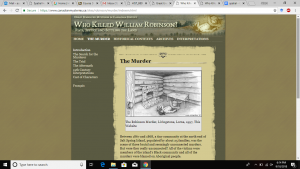
- The murder scene provides the best access point to creating a spatial study for the website. We could use the primary source documents to visually recreate the scene. Our website relies solely on text and offers no 3 dimensional space. We would not adjust our definition after interacting with this site.
- The site is making an argument that this experience mimics the experience of a historian actually visiting an archive.
- Getting the public engaged in primary source documents in an accessible way. The categorization of the primary sources in a logical manner makes it less intimidating.
- The intended audience is likely teachers, students, and the general public who has interest in history.
- At first glance the interface seems kind of annoying and archaic, but when you take into account that it was created from 1997-2001, it actually looks pretty good. The photos are kind of low quality, but overall not bad.
- The website needs to add a “next” and a “previous” button. Actual images of a select number of the primary sources could provide a visual component. Adding 3D or more complex images would also add to the experience. Not really anything that we would remove.
- The site uses digital technology to convey historical knowledge very well. There is a lot of information, both primary and secondary sources, and the format is accessible. It doesn’t convey spatial knowledge as well, but this is probably due to the technological limitations of the time it was made.
Site Review:
This site uses text and images to recreate the experience of a historian researching primary sources in an archive. By doing the organizational work for the user, primary source documents are now available to students who lack the skills necessary otherwise. The user is asked to “solve” a murder mystery by examining the primary sources. The murder is placed in the historical and regional context at the time of the event. Students are encouraged to delve into a time and place they may be unfamiliar with. The site is likely used for classrooms, where students can create profiles and interact with the documents with the end goal of solving the mystery. By creating their own interpretive essay, students are essentially creating a secondary source document from the provided primary sources.
The site has a lot of potential, but is limited by the technology of the time it was made (1997-2001). The images are not high quality, and there is no interactivity. The color scheme is a bit bland for a website geared for young students. We also feel that there lacks an overall cohesion between the links provided. The “choppiness” of the website would be alleviated with more buttons. The user would be assisted with a short video that could frame the overall goal of the website and the desired final outcome.Given additional funding and work on the site it is easy to imagine the website could provide even more information and interactivity, and so could be an even better teaching tool. Overall the site is very informative and provides a great deal of information, images, etc. It is likely a very effective teaching tool as is, but needs an update.

